Four-A-Bowl
A bowl shop website with a taste of the real place.
Channahon, Illinois
Live website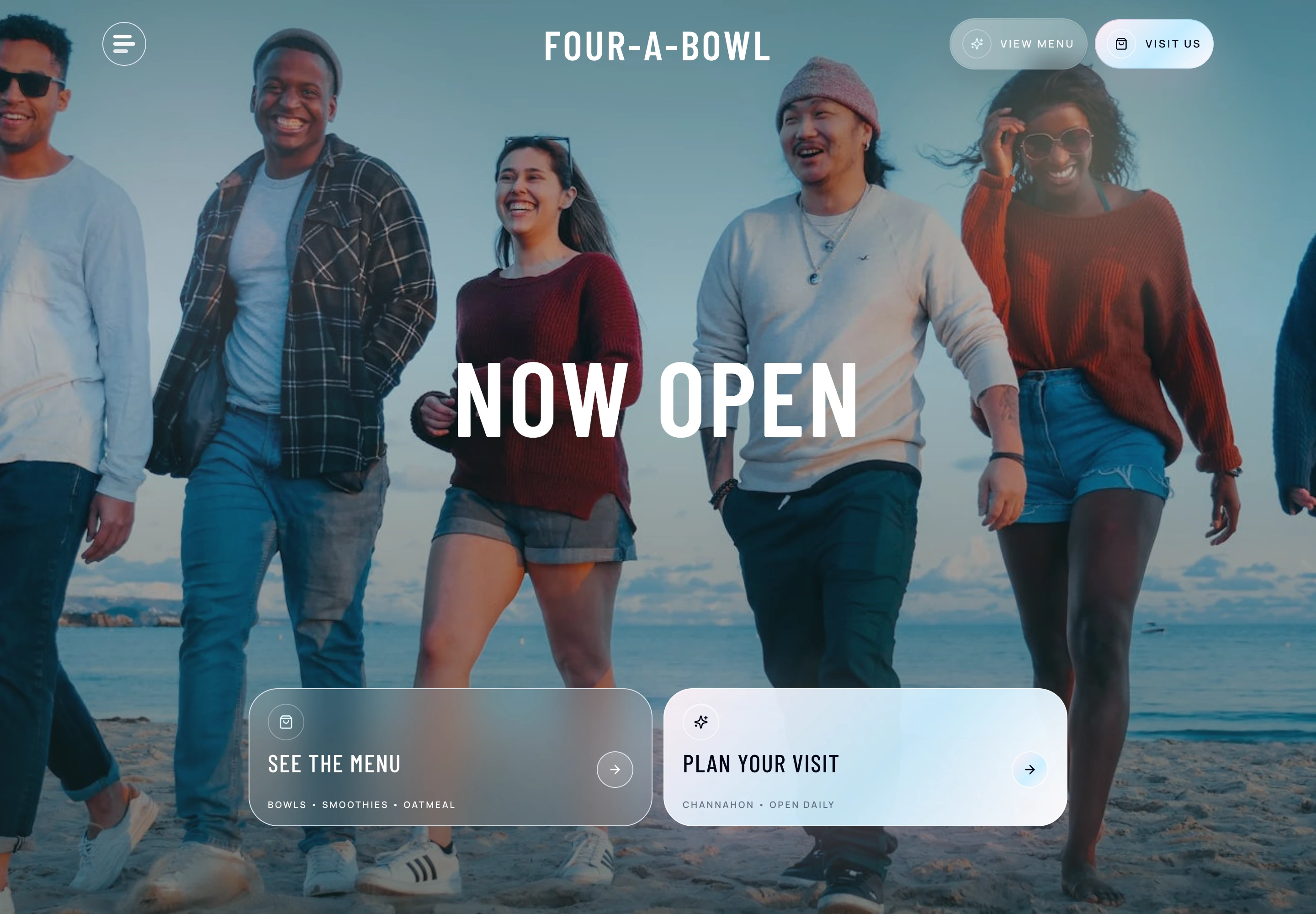
The project
Four-A-Bowl is a Channahon açaí bowl and smoothie shop. The website pairs the feel of the brand with a clear menu and the practical details customers need before visiting.
Give someone discovering the shop a quick feel for the food and atmosphere, then make it easy to browse the menu and plan a visit.
- What I worked on
- Restaurant website design
- Menu presentation
- Mobile layout
- Local visit path
Inside the website
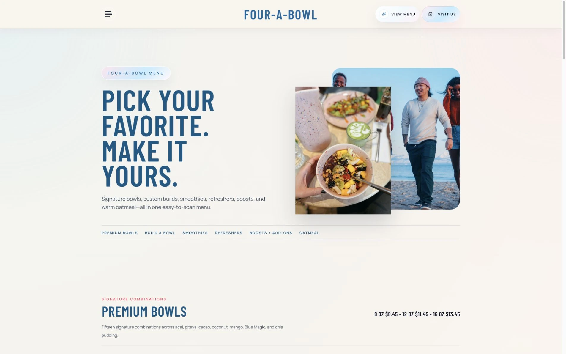
The menu, made easy to explore.
The menu opens with the brand's atmosphere, then gives customers direct routes into bowls, smoothies, and the rest of the lineup.
Category navigation sits in the menu page itself, so customers can jump to what they want while still getting a feel for the brand.
View the page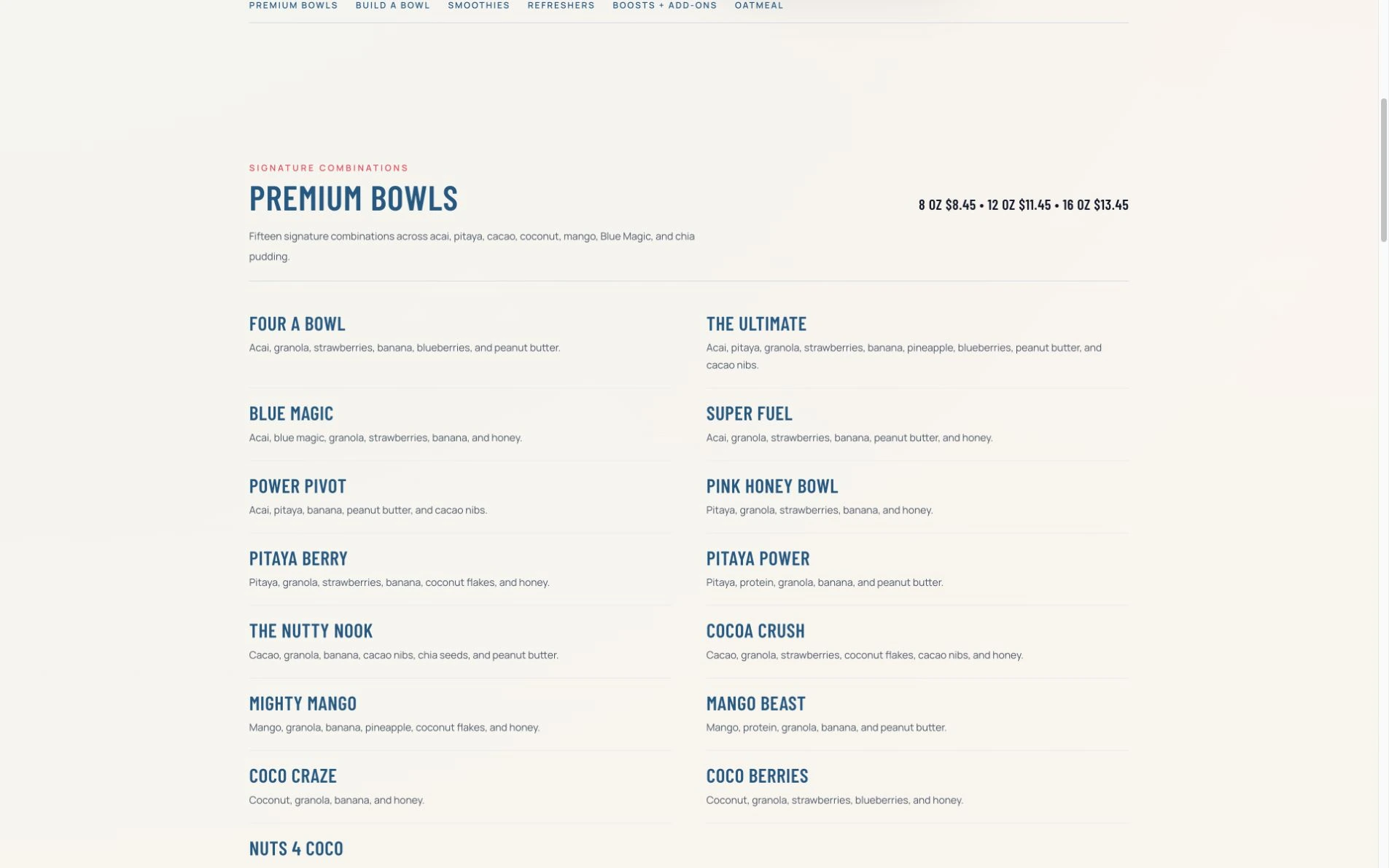
The details behind each bowl.
Category links, ingredient lists, and clear sizes let visitors compare the signature combinations without opening a separate document.
The ingredients are real page content rather than an image of a printed menu. That gives the combinations room to reflow on a phone and makes individual details easier to find.
View the page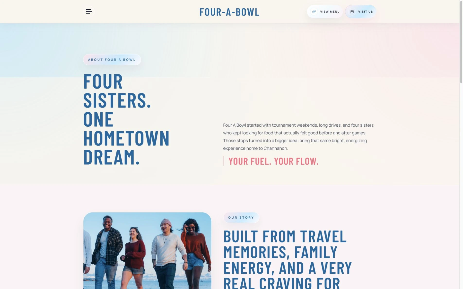
A local business with a story.
The about page connects the four sisters' tournament travel and food routines with the idea of bringing the shop home to Channahon.
The story gives the business a local reason to exist. A short introduction keeps it approachable before the longer background, using the same typography and colors as the menu.
View the page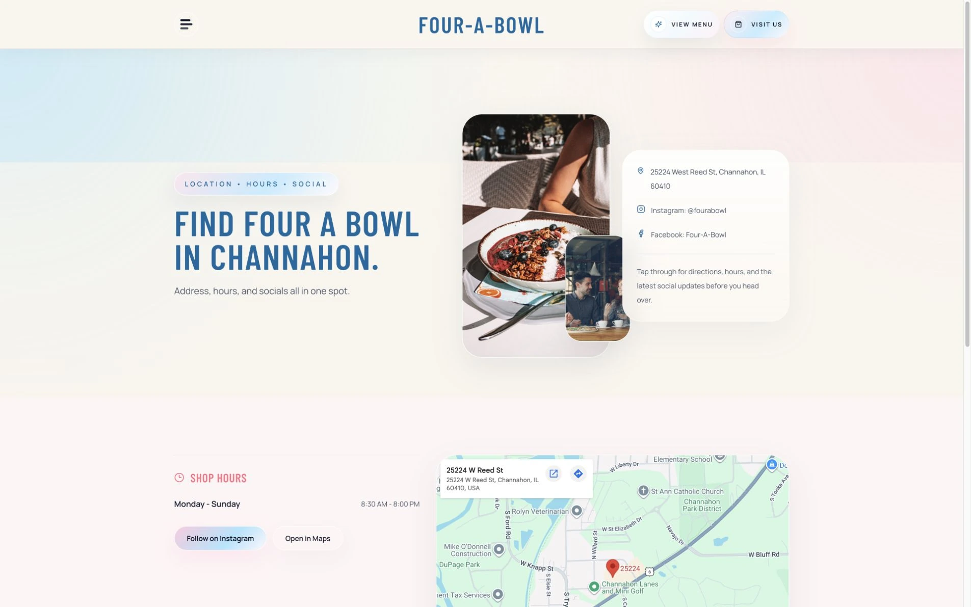
From browsing to stopping in.
The visit page brings the address, social links, and practical information together with food imagery, keeping the next step close to the brand.
The practical information stays together: location, social links, hours, and the map. Food imagery maintains the atmosphere while the content helps someone plan the trip.
View the pageDesign decisions
A first impression with personality.
Brought food imagery and the shop's visual identity into the first impression.
A menu worth exploring.
Made the signature menu a central part of the website rather than an afterthought.
A visit that feels easy.
Paired the brand story with useful visit information and a clear next step.
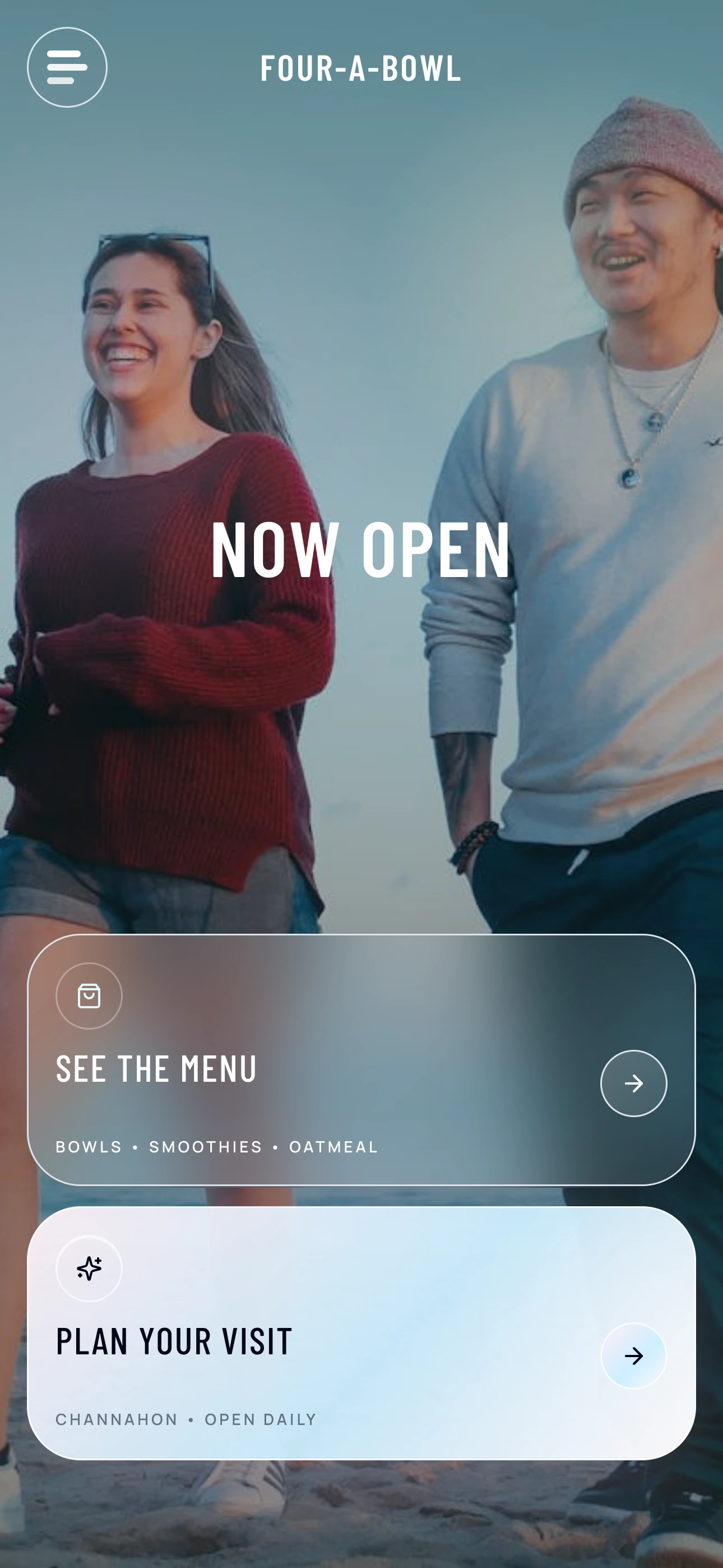
The same clarity on a phone.
Kept menu discovery and the local visit path readable on a phone.
A menu in your pocket.
Kept menu discovery and the local visit path readable on a phone.
From the client
“Working with Alec and Frontstage Web Design was one of the best decisions I made for my business. From the very beginning, he took the time to understand my vision, brand, and goals, and then brought everything to life in a way that exceeded my expectations.”Review from Four-A-Bowl
The result
The finished website gives Four-A-Bowl a visual introduction that leads into the menu and a visit decision. The client's feedback reflects the care taken with the brand and project.
Request a website quote