Homestead Refillery
A digital storefront that feels closer to the Morris shop.
Morris, Illinois
Live website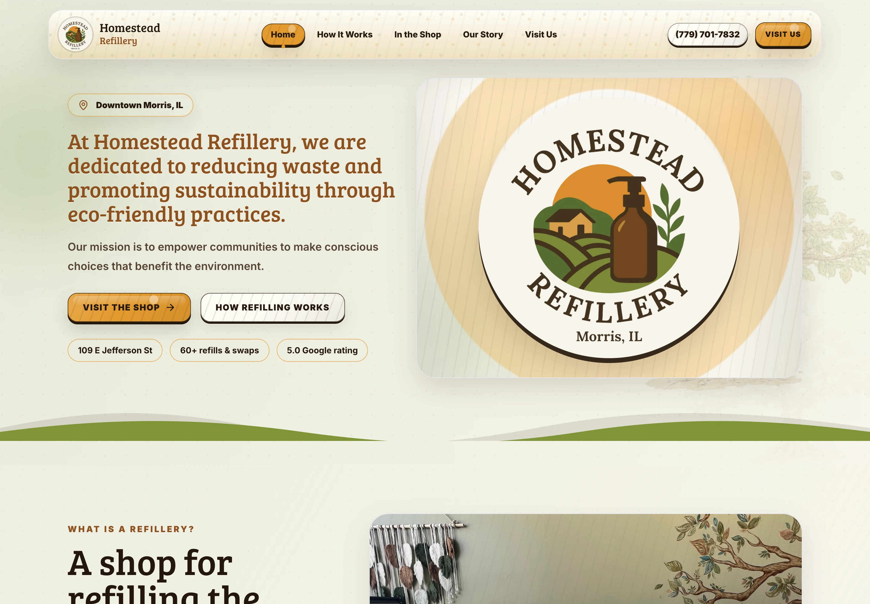
The project
Homestead Refillery already had a distinct local mission. The redesign focused on making that mission, the products, store details, and reasons to visit easier to understand online.
The site needed to feel like the real shop: specific, welcoming, and useful to someone checking the mission, products, and visit details before heading to Morris.
- What I worked on
- Website redesign
- Sustainable retail storytelling
- Store-detail organization
- Mobile refresh
Inside the website
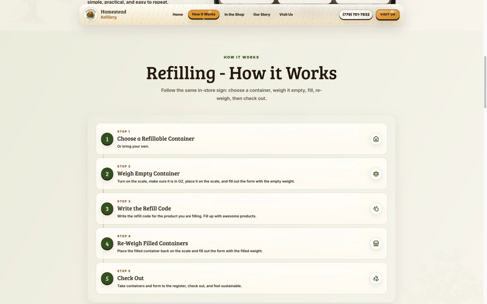
Explain the first visit.
The refill instructions follow the shop’s process: choose a container, weigh it empty, note the refill code, fill and re-weigh, then check out. Each step has a short explanation.
Sustainability is the reason to care, but knowing what to do is what makes a first visit feel manageable. The process is kept in the homepage story so visitors can understand it before going elsewhere.
View the page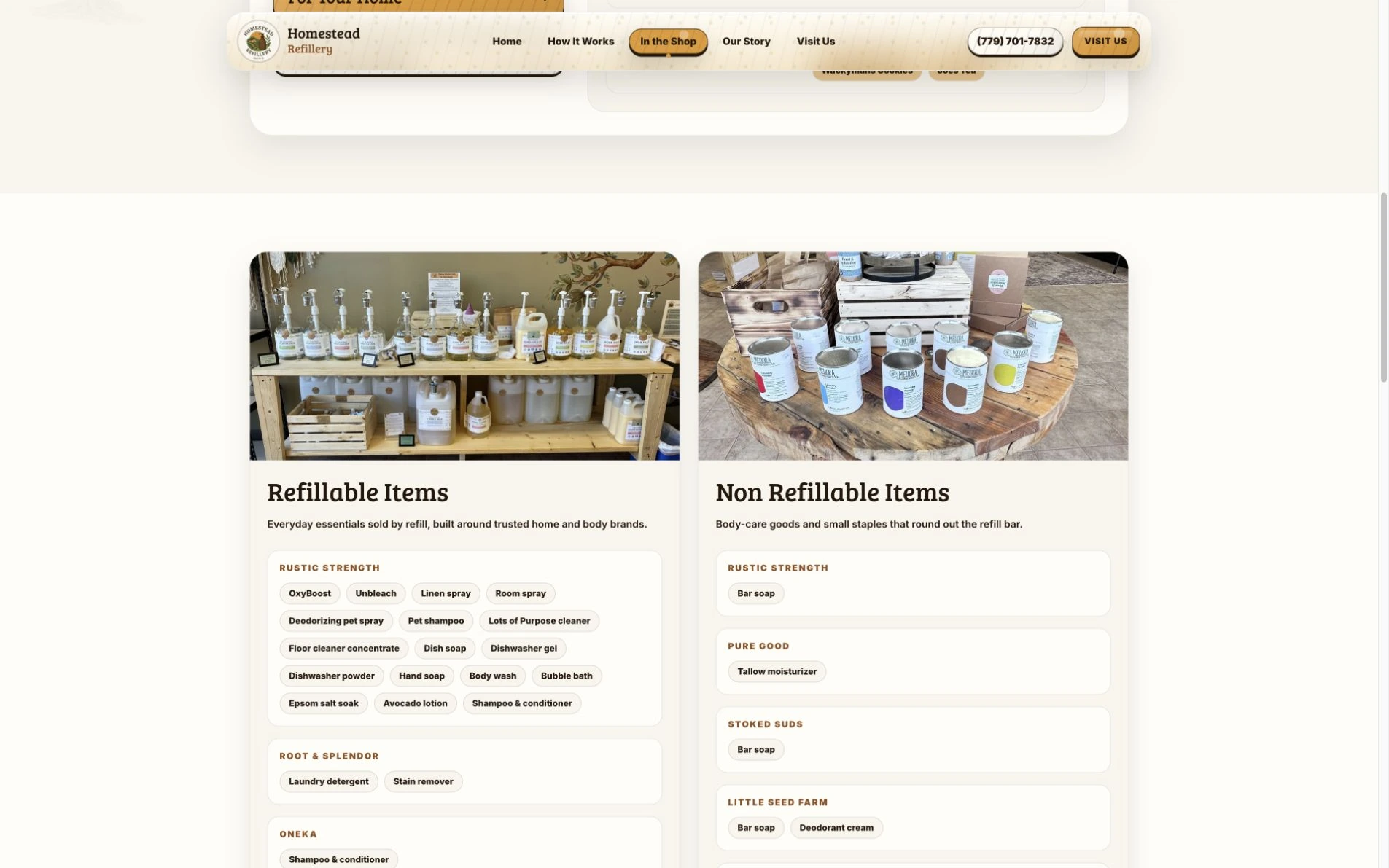
Organize the shop around everyday needs.
The shop page separates refillable products from other goods and groups the product names by brand. Real shelf and table photography connects that information to the physical store.
The page helps someone work out what they can bring a container for and what they can buy as a separate item. Specific product names make the mission more useful than a general list of eco-friendly categories.
View the pageDesign decisions
The shop, online
Reframed the homepage around the refillery mission and the experience of visiting the shop.
Useful visit details
Made store details, products, and ways to visit easier to find.
Mobile hierarchy
Improved the mobile hierarchy for customers checking the business from a phone.
A familiar identity
Preserved the local identity while giving the site a cleaner, more deliberate visual structure.
Plan a visit from your phone.
Improved the mobile hierarchy for customers checking the business from a phone.
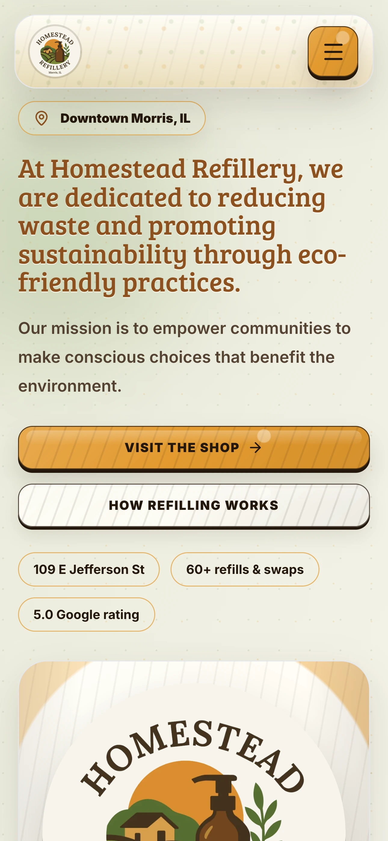
Wood warmth, without the rustic theme.
The buttons use wood as a material cue instead of decoration. Warm amber, fine grain lines, and a dark pressed edge echo the shop environment; crisp type, restrained rounding, and generous spacing keep the treatment modern instead of rustic or theme-y.
Before & after


The result
The refreshed site gives the Morris shop a clearer digital front door for customers learning about the mission, checking products, and planning a visit.
Request a website quote